Booked while you sleep.

The parts the AKHY website is built from: colour, type, spacing, motion and the components that use them. Every value here is a Webstudio variable or token, so a change in one place carries through the whole site.
Ink carries the page, Cream carries the words, Ember marks the one thing to press. Fern only ever confirms.
#0B0B0A --ak-ink
Page background#141311 --ak-surface
Panels and large cards#1C1A17 --ak-card
Cards, icon circles#2E2A25 --ak-line
Dividers, off states#EFE6DA --ak-cream
Text and marks#CFC3B2 --ak-stone
Secondary text#A79D8F --ak-muted
Captions, hints#E2552D --ak-ember
The one action per view#B23E1C --ak-clay
Orange text on light grounds#6E9B77 --ak-fern-soft
Booked, confirmed, onInk 60 Surface and Card 22 Cream 12 Ember 4 Fern under 2. If you notice the Fern first, there is too much of it.
Gabarito for anything you read at a glance, Figtree for anything you read in full, DM Mono for times, prices and labels.
ak-type-display Gabarito 700, 56 to 128px, tracking -4%
Designed to be booked.
ak-type-h1 Gabarito 400, 34 to 72px, line 0.95
Book more, chase less.
ak-type-h2 Gabarito 500, 24 to 36px
Your website, working overnight.
ak-type-h3 Gabarito 500, 20 to 24px
Booking, payments, reminders
ak-type-body Figtree 400, 16px, line 1.6, max 65 characters
We design brands and build booking websites for service businesses, so your calendar fills while you work.
ak-type-small Figtree 400, 14px, Stone
Automatic reminders cut no-shows without you lifting a finger.
ak-type-label DM Mono 500, 11px, uppercase, tracking +14%
Get in touch
ak-type-mono DM Mono 400, 13px, tabular figures
Thu 16 Oct 1:00 pm $45 deposit
Sentence case everywhere. One weight change per line at most. Keep body lines under 65 characters. Labels are the only uppercase text, and they stay short.
A 4px base with an 8px rhythm. Rounded where people touch, softer where things hold content.
--ak-space-1 4px
--ak-space-2 8px
--ak-space-3 12px
--ak-space-4 16px
--ak-space-5 24px
--ak-space-6 32px
--ak-space-7 48px
--ak-space-8 64px
--ak-space-9 96px
--ak-space-10 128px
--ak-radius-sm 12px
Inputs, icon tiles--ak-radius-md 16px
Cards--ak-radius-lg 32px
Hero frame, panels--ak-radius-pill 999px
Buttons, pills, chipsFlat: cards sit on colour, not shadow
Float: only for things over video, --ak-shadow-float
Tablet 991px Mobile landscape 767px (nav pill becomes the menu) Mobile portrait 479px Hover devices only get hover styles
Fast where the site responds, slower only where it tells a story. Motion confirms what a person did; it never makes them wait.
--ak-ease-out cubic-bezier(0.23, 1, 0.32, 1)
ease
--ak-ease-brand cubic-bezier(0.16, 1, 0.3, 1)
--ak-ease-brand
Webstudio Animation Group
Reduced motion breakpoint
Never animate from nothing: scale starts at 0.95 or above, always with a fade.

Work

Services

Process

Pricing


Call

Date

Time

Menu

Close

Go

Done

Open

More

Help
ak-icon-tile 48px, radius 12
ak-icon-circle 46px, inside pills
ak-btn-primary + ak-btn-primary-icon Ember pill, Ink text. Hover opens the gap, press shrinks to 0.97, Cream focus ring.
ak-btn-secondary Cream outline for second choices. Any number per view.
ak-btn-link for inline actions in cards. ak-btn-icon 56px for the mobile menu; it always needs an aria-label.
Cards sit on colour, not shadow. Media cards carry the photography; feature cards carry a promise and its proof.
Booked while you sleep.
 Online booking, deposits and paymentsAutomatic reminders that cut no-showsBuilt mobile-first, where clients book
One person from first sketch to launch day.
Panels hold a single statement on Surface with the largest radius.
ak-card-media ak-card + ak-icon-tile ak-panel. Numbers in brackets only when the cards really are a sequence.
Labels above fields, hints below. Focus turns the edge Ember so people always know where they are typing.
ak-field ak-field-label ak-input ak-textarea ak-select-trigger ak-radio ak-check ak-switch. Native Webstudio form, Radix select, radio group, checkbox and switch.
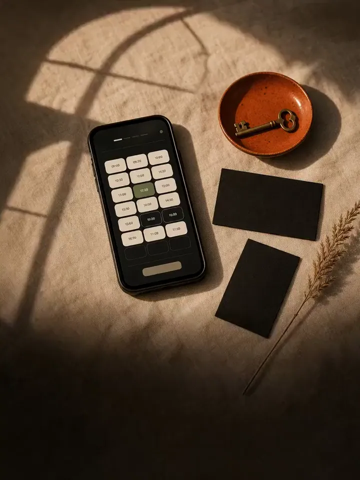
The moment the brand exists for. Open times read as outlines, the chosen time fills Cream, taken times are struck through.
ak-badge + ak-dot Fern dot for open availability, Ember dot only for real scarcity.
ak-slot is a Radix radio item: arrow keys move between times, disabled times are skipped.
Tabs, questions, hints and confirmations. Overlays open from what you pressed and close with Escape.
Brand identity, booking websites, and hosting and care. Pick one or all three.